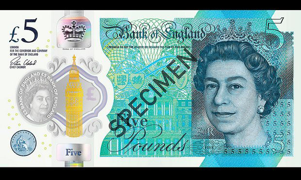
There are red faces all over at the Royal Mint Drawing Department today as the wrong fonts have been printed on the new £5 notes.
Money Artists commissioned by the Bank of England have admitted this evening that they forgot to outline the fonts before sending the note to print.
As a result some fonts have been replaced – and some given an ugly stroke effect.
The Queen – star of notes and coins is thought to be unimpressed saying:
“The pound symbol looks stupidly small compared to the five, Harry is good with photoshop, they could have asked him.”